Creating a Dynamic Home Assistant Dashboard for Your Kitchen Tablet
I built a kitchen tablet dashboard that feels like a pared-back iOS app. It shows the things I need at a glance. It reacts to states, not to guesses. This guide explains the practical steps I followed to get a clean, responsive Home Assistant Dashboard on a tablet and how to make cards change with real-world conditions.
Getting Started with Your Home Assistant Dashboard
Overview of Home Assistant Dashboard
Home Assistant Dashboard is the Lovelace frontend that sits on top of Home Assistant. It shows views, cards and controls that tie into your devices and sensors. I treat it like a control panel rather than a dashboard full of telemetry. Use the Lovelace raw editor or YAML mode when you need precise behaviour. For a tablet, the companion app or a kiosk browser gives the best full-screen experience.
Essential Tools and Resources
You will need:
- A running Home Assistant instance (Core or OS).
- HACS installed to manage custom cards and integrations.
- The Home Assistant Companion app for iOS/Android, or a kiosk browser for full-screen.
- Custom cards: custom:button-card, card-mod, and conditional card are minimum.
- Basic YAML familiarity for template sensors and view layout.
Install HACS first, then add custom:button-card and card-mod from HACS. They are the building blocks for an iOS inspired dashboard look.
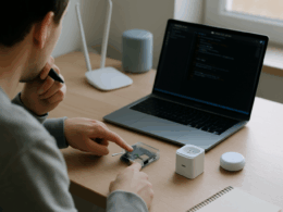
Preparing Your Tablet for Dashboard Use
Decide where the tablet will live. Wall-mounted or propped on a stand? That affects screen orientation and touch targets. On iOS use Guided Access to lock the app and disable accidental gestures. On Android enable kiosk mode or use an app that forces full-screen. Turn off auto-lock or set it long enough to avoid repeated unlocks. Set the tablet to a stable IP or reserve it in your router so the dashboard stays reachable.
Charge management matters. If the tablet reboots on power loss, have a startup script or Home Assistant automation to open the dashboard. I set the tablet to auto-launch the Companion app and configured it to go straight to my kitchen view.
Key Considerations for Customization
Decide what the tablet must show at a glance. Prioritise actions and states. Keep touch targets large. Use clear contrast and a minimal palette for quick reading across different lighting. Think about offline behaviour. If Home Assistant is unreachable, show cached states or a clear offline card rather than a blank screen. Finally, lock critical controls behind an extra confirmation if the tablet is in a public area of the house.
Designing Your Custom Dashboard
Inspiration from iOS Design Principles
I copied a few iOS ideas: simple spacing, rounded corners, subtle shadows and clear hierarchy. Icons sit above labels. Important controls are larger and centrally placed. Colour is used sparingly to indicate state changes rather than as decoration. This approach keeps the interface readable from across the kitchen table and makes touch interactions predictable.
Creating Dynamic Cards
Dynamic cards change based on sensors and time. Use conditional cards and template sensors to show the right controls when they are relevant.
Steps I use:
- Create template sensors in configuration.yaml for derived states.
- Use conditional cards to show cards only when conditions match.
- Use entity-filter or auto-entities (HACS) for lists that change automatically.
Example template sensor that defines a simple kitchen mode:
yaml
template:
- sensor:
- name: “kitchenmode”
state: >
{% if isstate(‘binarysensor.kitchenmotion’, ‘on’) %}
active
{% elif states(‘sensor.kitchenambientlight’)|float < 20 %}
dim
{% else %}
idle
{% endif %}
- name: “kitchenmode”
Example conditional card showing a recipe timer only when the oven is on:
yaml
type: conditional
conditions:
- entity: switch.oven
state: ‘on’
card:
type: entities
title: Oven controls
entities:- entity: timer.roast
- entity: inputnumber.oventemp
These patterns let the dashboard adapt during cooking. I prefer showing fewer, relevant controls rather than everything at once.
Configuring Custom Button Cards
custom:button-card is central to my layout. It supports templates, state-based styling and actions.
Example button template:
yaml
type: ‘custom:button-card’
entity: light.kitchenmain
name: Kitchen
icon: mdi:lightbulb
showstate: true
tap_action:
action: toggle
styles:
card:
– border-radius: 12px
– padding: 12px
name:
– font-size: 14px
state:
- value: ‘on’
color: ‘#ffd166’
styles:
card:
– box-shadow: ‘0 6px 12px rgba(0,0,0,0.12)’
I create a small library of templates: primary action, small indicator, and large media control. Reuse keeps the UI consistent and makes updates trivial.
YAML Configuration for Home Assistant
I keep the kitchen view in Lovelace YAML so I can use templates and include files. If you prefer the UI editor, move to raw editor when a custom card needs more control.
Minimal view example:
yaml
views:
- title: Kitchen
path: kitchen
cards:- type: grid
columns: 3
square: false
cards:- type: ‘custom:button-card’
<<: *kitchen-primary - type: conditional
conditions:- entity: sensor.kitchenmode
state: ‘active’
card:
type: ‘custom:button-card’
name: ‘Cooking timer’
tapaction:
action: navigate
navigation_path: /lovelace-kitchen/timer
- entity: sensor.kitchenmode
- type: ‘custom:button-card’
- type: grid
Use the Raw configuration editor to paste these snippets, or keep them in packages for clarity. Commit small changes and reload Lovelace to test.
Final Touches and Testing
Test every interaction with a tablet in place. Do the tap targets feel right when standing? Does the screen remain readable in bright light? Simulate offline states by stopping Home Assistant briefly and confirm the fallback UI is acceptable. Check that automations tied to buttons perform reliably. Tune polling and entity refresh rates if latency is a problem.
Concrete checks I run:
- Tap each button and verify the mapped entity changes state.
- Turn devices on via other interfaces and confirm the dashboard updates.
- Switch to night mode and confirm colour and contrast are still clear.
- Reboot the tablet and confirm the Companion app returns to the kitchen view.
If a card behaves oddly, inspect the browser console on the tablet (use remote debugging) and check Home Assistant logs. Small fixes often resolve large UX issues.
Final takeaways: keep it simple, make actions obvious, and make cards dynamic so the dashboard only shows what matters. That gives a kitchen tablet that feels immediate and stays useful in daily life.